

A New and Improved Home Screen | Fresh Tri
MY ROLE
One of 4 product designers - my jobs included discovery, ideation, usability, research, prototyping, iteration
PLATFORM
Mobile
TOOLS
Figma
Whimsical
Illustrator
Photoshop
TIMELINE
Fall 2021 - Fall 2022
In the summer of 2021, I joined the most talented team of individuals at Fresh Tri. Together, we were tasked with taking Fresh Tri to the next level - after a user finishes onboarding, what’s next? Where does the user go next? This was the question that started this project, and launched it into the future of Fresh Tri.
This project was a team effort - huge shout out and credits to John Beck (Senior Product Designer) Jordan Butler (Product Designer), Anxhi Subashi (Product Designer), Casey Hughes (VP of Behavior Design) and Jeff Jureller (Product Manager).
Summary and Team

Credit: https://freshtri.com/iterative-mindset-method/Fresh Tri is a habit changing app that based in science and research-backed psychology. Using the Iterative Mindset Method™, users can break old habits and build new healthy ones. With the support of a thriving Tri(be) community and licensed practioners, users have the resources they need to reach their goals in a reliable and sustainable way. Learn more on the company website.
About Fresh Tri
The original home screen/home base of the Fresh Tri app didn’t have a lot of direction - our users didn’t know where to go, or what to do next after onboarding. We were tasked with figuring out how to make the home screen an intuitive and functional place for users to come back to every day.
Listening to the customers
We also received the feedback that the Tri(be) section of the app was the many users favorite part of the experience. Tri(be) is a place where Fresh Tri users can connect with each other and come together as a community. We took this very seriously and incorporated it into the new design.
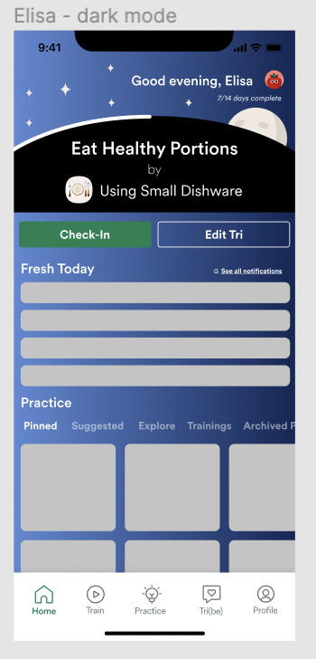
The original home screen
The original home screen presents several key usability challenges. Firstly, a significant issue is the lack of clear direction for users once they access the home screen. The presence of check-in bubbles is confusing and doesn't provide a meaningful or intuitive way for users to proceed. Furthermore, the inclusion of train videos, which seem to have low user engagement and utilization rates, detracts from the screen's focus. Additionally, there is no easily accessible entry point to Tri(be), the most popular feature of our platform, making it frustrating for users who are seeking it. Moreover, the absence of a convenient place for users to iterate on their Tri further compounds the ineffectiveness of the home screen. All of these issues combine to create a home screen that not only lacks clarity and coherence, but also fails to direct users efficiently towards the platform's most valued and used features. Addressing these issues through thoughtful design and user-centered solutions is crucial for enhancing the home screen's effectiveness and improving the overall user experience.
The VP of Behavior Design, Product Manager and Senior Designer provided general requirements based on features requested by customers, and the most effective solutions based on brain science. After discussions with the team, we decided to take inspiration from common features that our user base was familiar with, as well as making note of things that aren’t working in those products (things to avoid). We did market research and some “blue sky” ideation to really think outside the box and produce new and fresh ideas based off effective design principles.
Laying out the requirements


Market Research
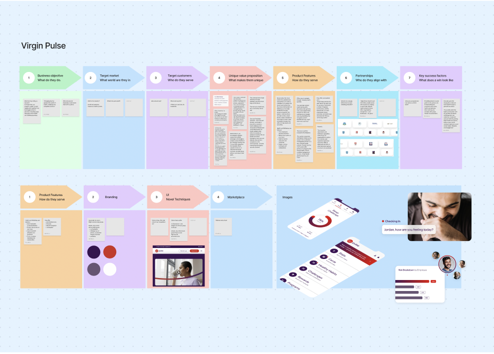
We were full of ideas and excited to hop into more detailed work, so we moved onto low and high fidelity screens. I had ideated solutions based on the needs of the users and the PMs requirements, so I went from there. I absolutely love the visual design elements of the process.
We did have an original home screen base to work off of, so creating complete new wireframes didn’t seem necessary. I used the original screen as a rough base for my designs. I experimented with different components, styles and aesthetics to create a vibe based on a the core goals of this project:
clarity
excitement
accessibility
tranquility
acceptance
Every iteration and every idea helped me decide what I wanted to go with next. Each one of the designers on the team created unique work, which all ended up in the final product. We were stronger together as a unit - a great example of how two heads are always better than one.
Low/High Fidelity Screens


Something that we focused very closely on during this process was making sure that the app was a welcoming, accepting place. We worked hard to remove all judgement and “measuring” from the process. We wanted to avoid the traditional form of “tracking” progress, and do it in our own way. This did become a challenge throughout the process - how do you measure without tracking? How do you track progress without judgement? How do you keep users coming back, time and time again?
To fix these issues and enhance the overall user experience, it was imperative to address these challenges with a user-centric and meticulously designed approach. By carefully reconsidering the layout, content, and accessibility of the home screen, we ensured a smoother and more engaging user journey, ultimately improving the overall effectiveness of the product.
Challenges
After hours of work, iteration and testing, we came to the most recent version on the app: say hello to the new and improved Fresh Tri Home Screen.
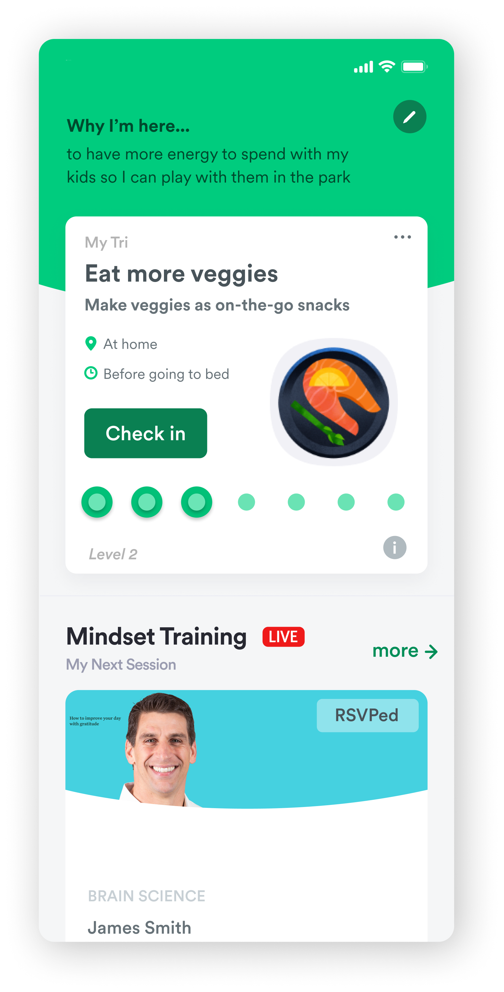
The New Home Screen


Easy access to the goal the user is working on
Judgement free progress bar with milestones to celebrate small victories, along with straightforward access to the iterate and checkin buttons
Tiles to encourage users to explore different parts of the app
A place for users to write their motivation for making a change in their life, a reminder why they started this journey
An alternative place to access the check in flow
Connection to Tri(be), to engage with the Fresh Tri community
Fun tiles to encourage users to gain new knowledge about healthy habits
The “What’s Next” home screen redesign was a massive success! It increased retention, engagement and was a huge conversion success. This project catapulted Fresh Tri into the next level of health and wellness - we were truly on the map now. Our product is helping people achieve their goals and heal their relationship with themselves. That’s the biggest success in my eyes, the lives that were changed and the people we helped.
There’s always going to be more to iterate on and improve on going forward (these are just a few ideas we have):
Further exploration of the Tri Model - how do we make it even easier to understand? Does it call for another overhaul? What else do our users need?
Continued improvement of the check in bar
Diving into the iterate tab and making that higher priority in the information architecture of the page
We will continue to listen to the users and evolve our designs to create the best version of this product that we possibly can. The journey is never over!